
What it does
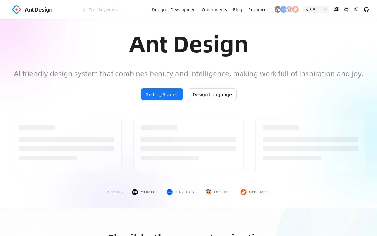
Ant Design provides the antd React component library for business web applications. It includes TypeScript types, configurable themes, internationalization and examples for application controls. The library is MIT-licensed and available through package managers without a product account.
Ant Design’s first example links a DatePicker to a message and an alert, showing how a selected date becomes application state and visible feedback. Open Getting Started to follow it in CodeSandbox or install antd in an existing React project. Component examples reveal their implementation through Show Code.
The library supports importing only the components a build uses. Its types are included, so a separate @types/antd package is unnecessary. Theme customization, localization, server rendering and framework-specific setup have dedicated guides.
This is a developer library: the guide assumes knowledge of React, HTML, CSS and JavaScript. Version 6 no longer supports React 16 or 17, and Internet Explorer support ended earlier. The MIT licence allows commercial projects with its copyright and permission notices retained.
Strengths
- Component demos include expandable implementation code
- TypeScript definitions ship with the package
- Modular imports help exclude unused components
Watch out for
- Ant Design 6 does not support React 16 or 17
- The library no longer supports Internet Explorer
Best for
- Teams designing data-rich business applications
Sources
- Ant Design (Oct 27, 2026)
- Ant Design of React (Oct 27, 2026)
- Getting started with Ant Design (Oct 27, 2026)
- Ant Design MIT licence (Oct 27, 2026)