
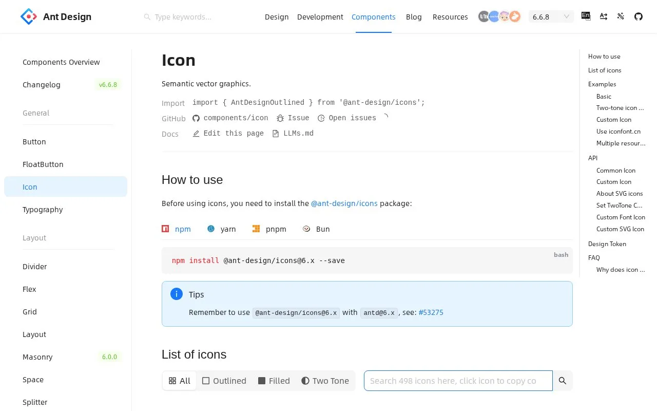
What it does
Ant Design Icons provides SVG symbols through packages for React, Vue, Angular and React Native. Its React components support styling, rotation, two-tone colors and custom SVG artwork.
In a React project, install @ant-design/icons and import the symbols you need. The current Ant Design 6 documentation pairs antd 6.x with icons 6.x. Names include the visual treatment: StarOutlined, StarFilled and StarTwoTone select different versions of the same symbol.
Set fontSize and color through style, or use twoToneColor for a two-tone icon. The result is SVG markup and can work offline without downloading an icon font from a CDN. Your own SVG can also be wrapped in the Icon component after being imported as a React component.
For an iconfont.cn project, createFromIconfontCN accepts its generated script URL. It can combine several URLs, but duplicate symbol names are overwritten in array order. Keep those names distinct if multiple collections are used together.
The documentation also identifies a CSS-layer issue when icons and Ant Design components interact. Its current remedy includes matching the package major versions and using the hook or App-provided forms of message, Modal and notification. The icon library is available under MIT.
Strengths
- Includes three visual treatments and controls for two-tone colors.
- Custom SVG components can share the same Icon wrapper.
Watch out for
- Duplicate names in combined iconfont.cn resources overwrite earlier symbols.
- CSS-layer setups need compatible versions and the documented Ant Design integration.
Best for
- Applications using the Ant Design visual language.
- React teams combining stock and custom interface icons.
Sources
- Icon: Ant Design (Oct 27, 2026)
- Ant Design Icons: Packages (Oct 27, 2026)
- Ant Design Icons: MIT License (Oct 27, 2026)