
What it does
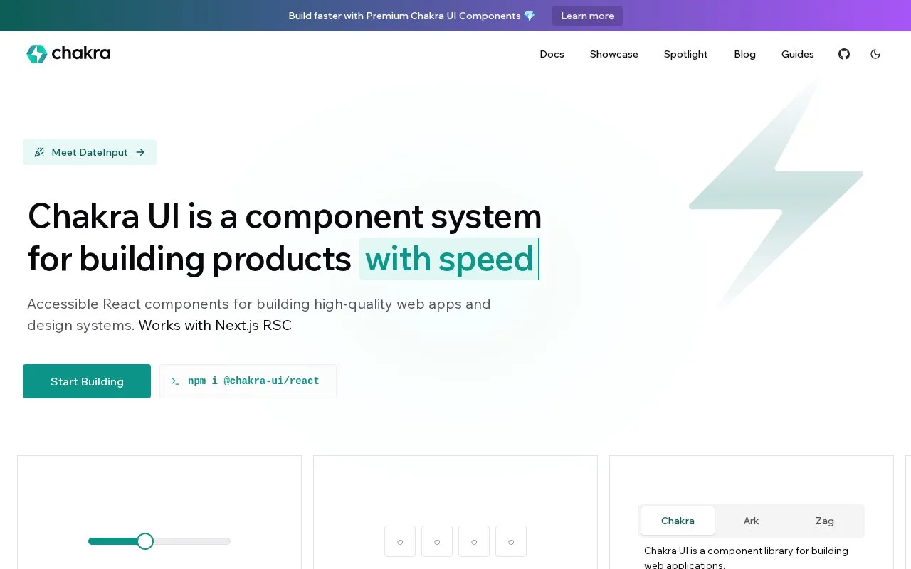
Chakra UI is a React component system for web applications and design systems. Its customization model includes semantic tokens, typography definitions and recipes for component variants.
Chakra UI puts shared colours, typography and component variants in one React styling system. Tokens hold reusable values, text styles define typography, and recipes describe variants such as different button treatments.
The current setup requires Node.js 20 or later. Install @chakra-ui/react and @emotion/react, then run npx @chakra-ui/cli snippet add to add the supplied component snippets. Wrap the application in the generated Provider: it combines Chakra’s styling provider with next-themes for colour mode. The installation guide also shows the required path and module settings for TypeScript or JavaScript projects.
Chakra UI is MIT-licensed and can be installed without a product account. Chakra Pro’s premium components and templates are separate. The current library still uses Emotion at runtime, so its announced move towards a different styling model should not be treated as an existing zero-runtime feature.
Strengths
- Tokens and recipes provide explicit places for shared design decisions.
- The generated provider combines component styling and colour-mode support.
- The React component library is available under the MIT licence.
Watch out for
- The current setup requires Node.js 20 or later and Emotion at runtime.
Best for
- React teams developing a reusable visual language
Sources
- Chakra UI (Oct 27, 2026)
- Installation | Chakra UI (Oct 27, 2026)
- chakra-ui/chakra-ui (Oct 27, 2026)