
What it does
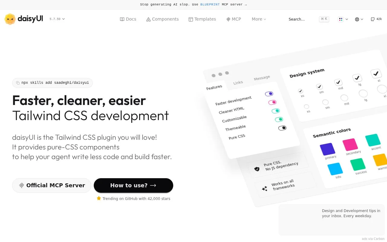
daisyUI is a Tailwind CSS plugin providing pure-CSS interface components. It adds semantic component classes, theme colors and visual variants that can be combined with Tailwind utilities.
With daisyUI, a button can start with btn btn-primary instead of a long string of repeated styling utilities. Classes such as card and toggle provide other reusable shapes, and ordinary Tailwind utilities can refine them.
In a Tailwind project, install daisyui as a development dependency and add @plugin "daisyui" after the Tailwind import in your CSS. Light and dark themes are enabled by default. Add another theme to the plugin’s themes list, then select it with data-theme on the page or an individual section. Nested sections can use different themes. The theme generator previews your colours on components and gives you CSS to copy into the project.
The library is free and MIT-licensed, with no account needed to install it. It supplies CSS without a JavaScript bundle; application state and any extra interaction logic still belong to your code.
Strengths
- Semantic classes reduce repeated styling decisions for common components.
- Themes and CSS-based components can be used across frontend frameworks.
- A theme can apply to an entire page or a nested section.
Watch out for
- CSS styling does not supply all application-specific interaction logic.
Best for
- Tailwind teams that want reusable component styling and themes
Sources
- daisyUI - Tailwind CSS Component Library (Oct 27, 2026)
- Install daisyUI as a Tailwind plugin (Oct 27, 2026)
- daisyUI themes for Tailwind CSS (Oct 27, 2026)
- saadeghi/daisyui (Oct 27, 2026)