
What it does
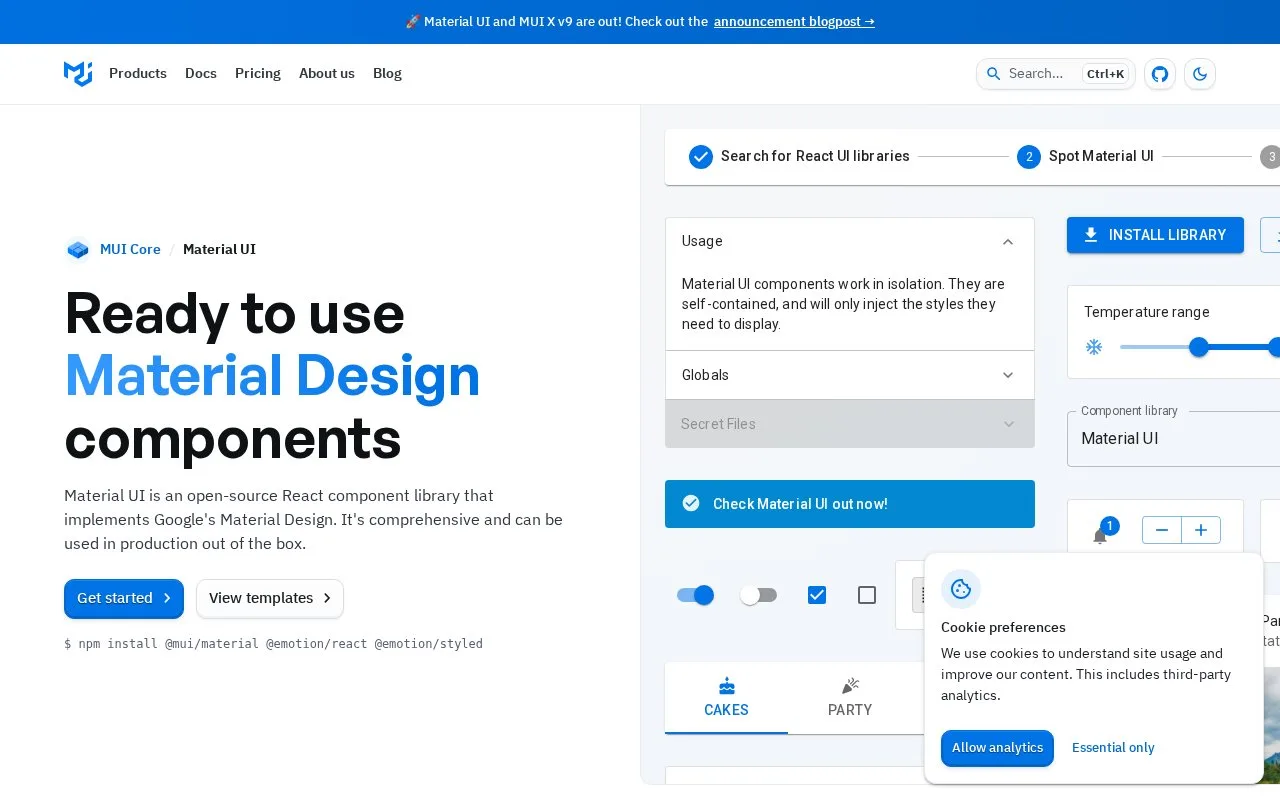
Material UI is an open-source React component library implementing Material Design. It supplies ready-styled controls and a theming system for adapting those controls to a product’s design tokens.
Material UI gives a React application ready-styled buttons, fields and other controls with Material Design defaults. Install @mui/material, @emotion/react and @emotion/styled in a project that already includes React and React DOM. Fonts and icon packages have separate installation steps.
To adapt the appearance, create a theme and place ThemeProvider above the components that should receive it. Palette, typography, spacing and breakpoints are shared settings; nested providers can give one area a different theme. Enabling CSS variables makes those theme values available through generated custom properties.
The core library is free under the MIT licence, with no account needed for package installation. Commercial MUI X features and paid templates are separate purchases. For React 18 and earlier, follow the documented react-is version override to avoid compatibility errors. The CDN example is intended for prototypes: it downloads the entire library and is not recommended for production.
Strengths
- Ready-styled React components implement a coherent Material Design language.
- Theme settings share colours, typography and spacing across components.
- The core library is free for use under the MIT licence.
Watch out for
- React 18 and earlier need the documented react-is version override.
- Advanced commercial MUI X features are outside the free core library.
Best for
- React teams establishing a shared interface component base
Sources
- Material UI: React components that implement Material Design (Oct 27, 2026)
- Installation - Material UI (Oct 27, 2026)
- Theming - Material UI (Oct 27, 2026)
- Pricing - MUI (Oct 27, 2026)