
What it does
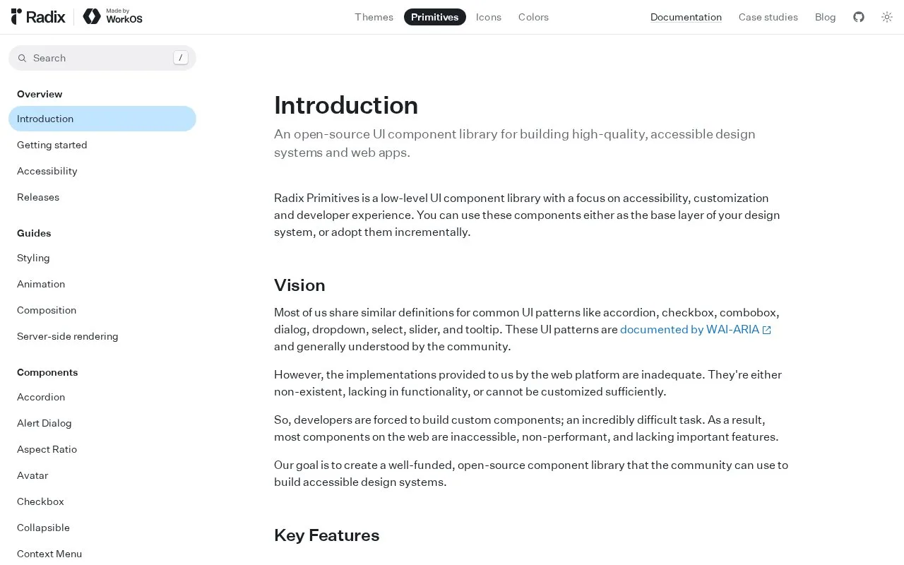
Radix Primitives is an open-source, low-level UI library for building design systems and web applications. It supplies behavior such as focus management and keyboard navigation while leaving visual styling to the product team.
Radix supplies interaction behaviour while letting you choose the visual treatment. Install the radix-ui package, import the primitive you need and style its parts with your existing CSS approach. You can adopt one component at a time.
A dialog illustrates the model. Combine Root, Trigger, Portal, Overlay and Content, then add Title, an optional Description and a close control. Modal dialogs trap focus, and Escape closes the dialog and returns focus to its trigger. Use open and onOpenChange when application state should control it, for example to close only after a form submission finishes.
The components are free under the MIT licence and need no Radix account. They arrive unstyled, so colours, spacing and visual consistency remain your responsibility. Keep the accessible title when changing the design; the documentation shows how to hide it visually without removing it from screen readers.
Strengths
- Unstyled parts allow a product team to retain its own visual design.
- Primitives address keyboard, focus and ARIA behaviour for common interactions.
- Controlled state supports flows such as closing a dialog after an asynchronous action.
Watch out for
- The library leaves the visual system and its consistency to the adopting team.
Best for
- React teams building a custom component system
Sources
- Introduction: Radix Primitives (Oct 27, 2026)
- Dialog: Radix Primitives (Oct 27, 2026)
- radix-ui/primitives (Oct 27, 2026)