What it does
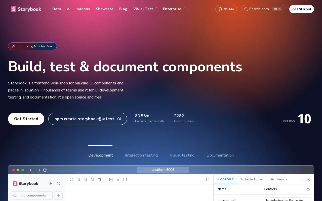
Storybook is an open-source workshop for building UI components and pages in isolation. Stories preserve component states for development, documentation and several types of interface testing.
Run npm create storybook@latest in the application's root directory. The installer detects the framework and offers a recommended setup with documentation, testing and accessibility tools, or a minimal component-development setup. Start the local workshop with npm run storybook.
Write a story with args for the state you want to examine. In the Controls panel, change those inputs and watch the component update. For a button that accepts only primary and secondary variants, configure argTypes with those options and a radio control, rather than leaving an unrestricted text field.
The workshop is free under the MIT licence and runs locally without a Storybook account. Its current installation guide requires Node.js 20 or newer and lists framework-specific minimum versions. Controls depend on stories using args; adding the panel does not automatically give an older story that structure.
Strengths
- A story can define extra controls for a child component, even when they are not properties of the main component.
- The installer can include example stories and an interactive setup tour.
Watch out for
- Automatic control inference may need explicit options or types for constrained component inputs.
Best for
- Teams developing and reviewing shared UI components
Sources
- Storybook: frontend workshop for UI development (Oct 27, 2026)
- Install Storybook (Oct 27, 2026)
- Storybook Controls (Oct 27, 2026)
- Storybook MIT License (Oct 27, 2026)