
What it does
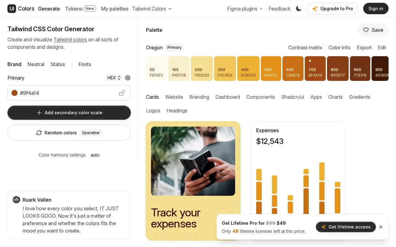
UI Colors is a Tailwind-oriented colour generator with previews for cards, dashboards, components, charts and other layouts. It separates brand colours, neutral surfaces and status colours, helping you see a palette in the interface where it will be used.
Add a neutral scale for text, borders and surfaces, then use success, information, warning and error scales for status messages. Switch between the Components, Dashboard, Charts and other previews to inspect the combination in different contexts. Base and heading fonts can be synchronized; custom font selection is an upgrade feature.
The separate Tokens beta adds radius, spacing and shadow controls alongside colour and typography. It has an Export theme action, but theme saving is still marked as forthcoming.
Developers can buy access to an API, a software interface for generating scales. A supplied hex colour becomes shades numbered 50 through 950, returned as hex and HSL values. Its terms prohibit using that service to build a competing colour-scale generator.
Strengths
- Status colours can be inspected on the same components as the brand palette.
Watch out for
- Theme saving is not yet available in the Tokens beta.
Best for
- Turning a brand colour into interface roles and theme settings
Sources
- Tailwind CSS Color Generator (Oct 27, 2026)
- UI Colors API (Oct 27, 2026)
- Build your design tokens visually (Oct 27, 2026)